
The Best & Worst Real Estate Logos of 2019 [+ pro Design Tips]

For upon |The real estate industry is changing rapidly. Great real estate logos are becoming a crucial way for new agents to cut through the noise online.
In order to highlight some of our favorite examples of real estate logos done right, we put together this list of 21 of our favorite real estate logos for 2018.
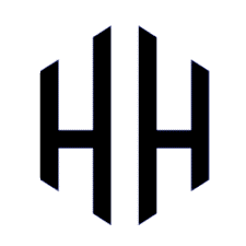
1.Hilton & Hyland

Founded in 1993 by developer Rick Hilton and broker Jeff Hyland, Beverly Hills’ most prestigious brokerages has always set the tone for luxury real estate in LA.
As you might imagine, scoring trophy property after trophy property in one of the most cut throat markets on the planet wasn’t easy. It took a rare combination of skill, great branding, and determination to get to the top.
Oh, and the branding they went with is bullseye perfection for their market. Simple, spare, elegant, and timeless, Hilton & Hyland’s logo oozes Beverly Hills glamour.
The monogram in particular wouldn’t look out of place on the hood of a priceless vintage car, or emblazoned on a cartier cigarette case.
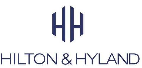
It works great stacked with their wordmark:
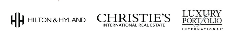
And really stands out even among well heeled brands like Christie’s International Real Estate, whom Hilton & Hyland became a founding affiliate of:
Hilton & Hyland’s logo was designed by Los Angeles-based Senior Graphic Designer and globetrotter Ann Dang. If you’re looking for a supremely talented designer for your next project, check out her website here.
2. Century 21

Okay, I know what you’re thinking.
We just waxed pretentious over Hilton & Hyland’s real estate logo and now we’re talking about boring old Century 21?
You bet we are. Century 21’s new branding is all kinds of awesome.
More to the point, good design doesn’t have to be fancy. It needs to project the right message to the right audience.
Here’s Mario Natarelli, Managing Partner at MBLM on what a good logo needs to do;
![Mario Natarelli-The Best & Worst Real Estate Logos of 2018]()
“Think of a great logo as a way to make both a strong first impression and leave an indelible mark.”

For Century 21, that audience is global, and increasingly represent every walk of life you can imagine. Sure, Century 21 agents sell the same eight figure mansions that Hilton & Hyland does.
They also sell $90,000 starter homes in Iowa.
Their new logo and branding tick the boxes for BOTH markets.
If you think that’s easy, try it!
It even looks amazing on tote bags:

3. Williams & Williams Estate Group
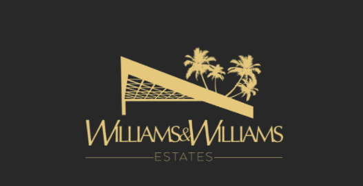
Okay, here we are again back in Beverly Hills… I know, but luxury brokerages take branding seriously, and probably spend close to your GCI on branding and videos alone….Their logo is no different.
Using John Lautner’s iconic Goldstein residence is an inspired way to connect a relatively new brand to Los Angeles’ history of luxury and elegance.
The gold might not pop very well on this page, but on a twilight shot of one the duo’s 8 figure mega mansions (Book matched marble walls, infinity pools, & Lambos included!) it works a
charm.
Even better, for me anyway, gold and LA go hand in hand. From Hollywood Regency design to 90’s Gangster rap album covers it just fits.
Honestly though, this logo is best experienced in its natural habitat. On the Williams’ website with a glorious video of an actual tiger strutting around in front of yet another LA trophy property to the tune of Beggar’s Banquet era Rolling Stones.

Seriously, check it out. You won’t regret it: https://thewilliamsestates.com/
4. Aaron Kirman Partners

Another LA superstar, Aaron Kirman is President of the International Estates Division of Pacific Union International and is consistently ranked in the top 15 agents in the country on the Real Trends 500.
His team’s real estate logo matches that track record of crushing it year after year.
A bit bolder and more masculine than Hilton & Hyland, and far more daring than C21, Aaron Kirman Partners logo remains just as timeless and elegant as both.
5. The Corcoran Group

When it comes to elegance and prestige, Manhattan’s Corcoran Group is hard to beat. Founded in the 1980’s by real estate royalty Barbara Corcoran, their logo proves the only hard and fast rule in graphic design.
Simple > Complicated.
The right font in the right size, in the right case will win over pretty much anything else. Text only logos like the Corcoran Groups look like they’ve just always existed.
Of course a great Manhattan luxury real estate brand should use that font!
Well, no. Not of course. Branding agency And Partners worked hard to make this logo look so easy. A great lesson for any new agents out there actually…
Think the top producer down the hall was born pitching expired listings? Think again. She probably worked at it every day for YEARS.
Hard work beats talent every day of the week in this industry.
6. The Habibi Group

Although strikingly similar to Hilton & Hyland, San Francisco’s the Habibi Group’s logo manages to stand on its own.
Unlike Hilton & Hyland, Habibi’s real estate logo feels modern rather than timeless. More like an elegant software company than a stuffy old money sports club…
That’s not why I love this logo though. The real reason it’s on this list is that brandmark. Notice how you start to see a three dimensional “H” when you look at it for more than a few seconds?
Very cool, and very hard to achieve. They obviously hired a typography geek for this one.
7. Sacha Radford

Okay, let’s switch gears a bit and check out a different take on an elegant logo. This example from Sacha Radford works on a few levels.
First. Bold sans serif fonts almost always look great for logos and headings.
Second, her brandmark might be a bit busy for some tastes, but it fits her brand perfectly.
Check out how it looks on Sacha’s website to see what I mean: http://www.sacharadford.com/
8. Nourmand & Associates

More like an elegant flag than a logo, Nourmand & Associates identity proves that great real estate logos can come from any era.
Say what you will, but the 1970’s brought us design icons like the Ferarri 308, and the Sydney Opera House.
Today, Nourmand’s logo reminds us that good design is timeless. It also reminds clients that Nourman had been thriving in California real estate for more than 40 years.
9. Partners Trust

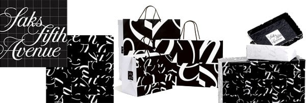
What I love most about Partners Trust logo is that it blends classical influences with an elegant serif font, and up-to-the-minute cool with a daring slash through the logo.
It always reminds me of Pentagram’s work for Saks Fifth Avenue;
10. North 8

Speaking on Pentagram, their work for Toll Brother’s luxury condo development at 49 North 8th Street in Williamsburg Brooklyn is another example of a killer real estate logo.
The bold blue and repeating text are the perfect fit for a new condo development in a former artists loft building enclave in New York City.
11. Who’s Who in Luxury Real Estate
Although they’re a trade association and not technically a brokerage, every luxury agency worth their salt is a member.
That’s why their brand, including this gorgeous logo, is top shelf.
A lion’s mane door knocker and a unique font immediately conjure up stately mansions and other homes that are priced like fine art instead of real estate.
12. Nicholas Property Group

Related Posts
Nicholas Property Group’s branding is a perfect example of how something as seemingly minor as tracking (the horizontal space between letters) can have a huge impact on what a logo connotes to the public.
In this case, the super wide tracking and skinny roman font evoke something literally written in stone.
Like most great logos, less is more. They’re connoting trust, elegance, and longevity using only a great font, and negative space. Impressive.
13. Keller Williams Global Property Specialists

Here’s a much more modern take on real estate branding from Keller Williams. Their Global Property Group logo is bold, modern, and luxurious.
I love the subtle change in the font weight between “KW” and “GPS”. It’s a nice way to not only separate the two acronyms, but bring in another word that helps their brand; GPS!
This is what happens when a great designer is in tune with their client. In the design world serendipity is rarely accidental. It comes from hard work, skill, and open lines of communication.
14. Engel & Volkers

For most real estate logos, “house” brand marks are the kiss of death. They look tired, dated, and just plain lazy:

We get it, you’re a company that sells houses…
That said, when done right, they can work very well.
Case in point, Engel & Volkers.
They used a bold sans serif with a pop of read on the ampersand, and above, a stately European mansion as a brand mark.
The only drawback here is that this brand mark is not strong enough to work on its own, which is the entire point of a brand mark. (think Apple’s iconic bitten apple or the Nike swoosh).
That said, they managed to pull it off.
15. Saunders
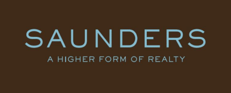
Hampton’s brokerage Saunders wisely went with something even more subtle. A simple, well tracked, thin sans serif font in a lovely shade of blue.
Since the Hamptons is a famous beach area for celebrities and power brokers from every industry, a calming blue was a great choice here.
Even without it, the logo is good enough to stand on it’s own two legs in black and white.
16. The Puck Penthouses
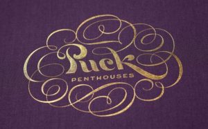
Another incredible brand from Pentagram, we absolutely love this script logo for the condos in Manhattan’s iconic Puck Building.
Beautiful on its own merits, it makes even more sense when you look at the historic graphic art that was featured on the turn of the century magazine that gave the building its name:
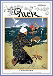
In New York City or any historic area really, historic significance can be an enticing selling point for buyers.
17. Julian Pilarski
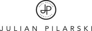
Another logo that manages to combine historic elegance and a modern sensibility, Julian Pilarski’s logo and brand mark tick all the boxes.
Elegant, simple, and a brand mark/monogram that can stand on its own.
What’s not to love?
7 Crucial Logo Design Tips for Agents, Teams, and Brokerages
Okay, now that you’ve feasted your eyes on some on-brand real estate logos that look and feel perfect, you’re probably scratching your head.
After all, these logos are all from billion+ GCI luxury brokerages in Beverly Hills.. How can you, with your shoestring budget end up with something even close?
Believe it or not, great design is actually not that hard. Yes, you need a talented designer, but as we said before hard work > talent even in graphic design.
To help you get started on your own logo, here are five tips for making something great.
1. Work With a Professional Designer

While you can and should do creative ideation and font research on your own, the difference between what a professional designer can create and what you can create is vast.
If you don’t believe me, try it. You’ll soon discover that even the smallest change in size, weight, font, color, etc. can have a HUGE impact on your design.
If you want to hire a talented professional logo designer with a limited budget, check out Designbro. Instead of being stuck with one designer, they let you have dozens of talented graphic designers pitch you ideas and you can pick the best one for only $199.
Visit DesignBro
2. Spend Hours Choosing Your Fonts Before You Talk to a Designer
While many people think that a font is a font is a font, in reality nothing could be further from the truth.
Typography, the study and practice of type design, is an artistic discipline unto itself. Some of the most talented graphic artists in the world work on nothing but type.
While your graphic designer will probably be an expert in fonts, many will still take hours just switching between different fonts to see what works.
Before they do, you can take the time to see what fonts you like online first. A site like Font Shop will let you see what your logo looks like in hundreds of high end fonts.
Take the time to go through them and send your favorites to your designer.
3. Simple > Complicated
Good design sends your customers a message. Great design sends your customers a message that they get immediately.
In most cases, that means a simple idea is generally better than a complicated idea. It will not only help you get your message across easier, it will help your logo look good in all sizes.
4. Make Sure Your Logo Works in All Sizes
Just because your logo looks great in Adobe Illustrator doesn’t mean it will look great for everyone. What does it look like on phones? What does it look like printed on a contract? On a business card? How about next to other logos?
You can test this pretty easily. Have your designer mockup your logo in different sizes and in different contexts. The most important one might be on a page with ten other real estate logos for brokerages with work in your area.
5. Before Choosing a Logo, See What it Looks Like Compared to Your Competition
Before you settle on a logo, you should know what it looks like next to your competition. That means you need to gather up the logos of your competition and put your logo options alongside them.
If you were a buyer or seller, what would you think about your company based ONLY on your logo? Does it look as good, better, or worse than the competition?
6. Talent Borrows, Genius Steals
This phrase is a cliche for a reason. Taking liberal inspiration from great logos in the industry is a smart business move. Yes, something unique and special might stand out from the crowd, but will it stand out in a good way?
7. Make Sure Your Logo Looks Like a Real Estate Logo
Your prospective clients should be able to glance at your logo and within a guess or two figure out that you’re a Realtor. Some logos look like lawyer logos, some look like heavy metal logos, sports logos, fashion logos, etc.
What does yours look like?
8. Work With a Professional Designer
While you can and should do creative ideation and font research on your own, the difference between what a professional designer can create and what you can create is vast.
If you don’t believe me, try it. You’ll soon discover that even the smallest change in size, weight, font, color, etc. can have a HUGE impact on your design.
You can find designers on Upwork, 99 Designs, or if you’re on a budget, your local design school.
Mistakes to Avoid: 5 Terrible Real Estate Logos
Now that we’ve gone through some of our favorite real estate logos, let’s take a look at some less than stellar examples to see what to avoid.
It’s important to not that these logos may come from excellent brokerages, and they may have good reason to stick with their branding.

Odd looking font, crowded text, and a less than flattering yellow background on an uninspired rectangle. To avoid this, remember to take the time to choose a great font, work with a pro, and think about color and layout.

Relying on 3d effects for your logo is never a good idea. It’s nearly impossible to recreate on fabric, and won’t look right in small sizes.

We already mentioned avoiding generic “house” icons for your brand mark, but it can’t be stressed enough. You should also know that you won’t be able to copyright your logo if you use brand marks from Canva or other stock image sites.
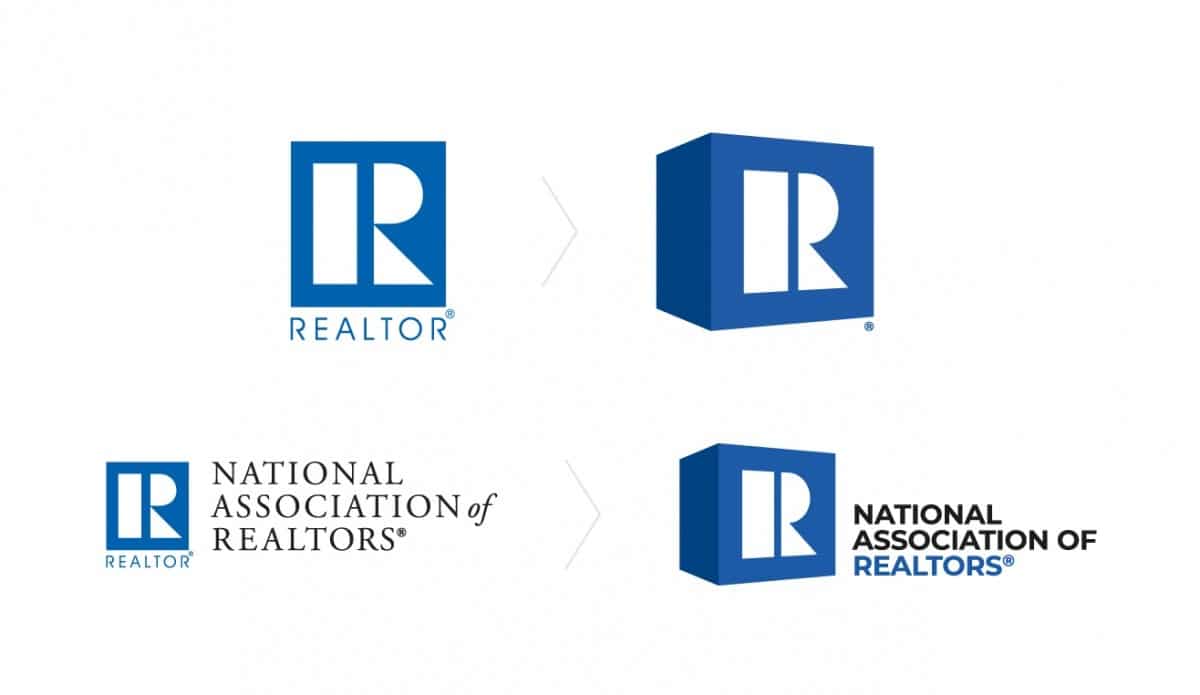
Some fonts will always remind people of the past. For example, the “R” in the NAR log still looks like it was designed in the 1960’s. Even with the updated branding the R still keeps this logo stuck in the bellbottom era.
If you needed more proof that font choice is crucial to a great logo, here it is. While this might have looked daring and cutting edge in 1971, today it looks dated and dull.
Over to You
What did you think of our choices for the best real estate logos? How about our tips for creating a great logo? Let us know in the comments!
The article was originally published here.
Comments are closed.